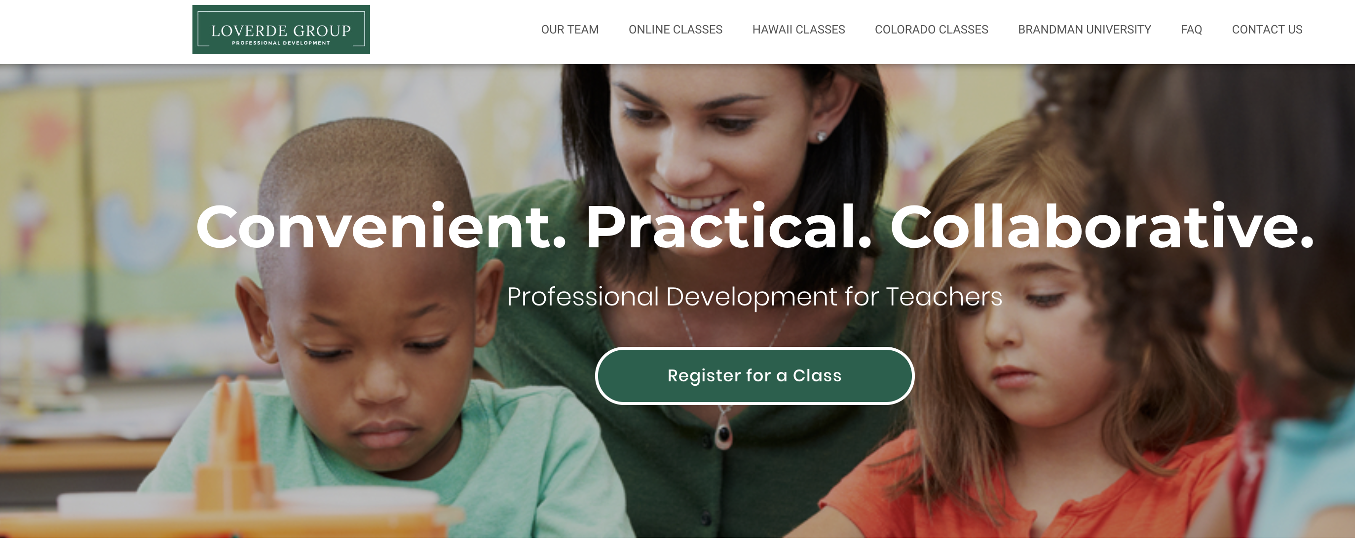
Web Designer – LoVerde Group

Part of every conversation about creating a website is why to have one: establish branding, increase functionally, garner new clients or use as an online resource. This website seemed to encompass all of them, and I believe that it was success as enrollment for online classes doubled just three months since the new website went up.
The branding I focused on was helping to personalize the experience and make visitors feel like they were connecting with actual people. After brainstorming with the client, we decided to create videos that guide teachers through the process and show how to use the website. The videos with the online coordinator help add a human touch that’s not the same as simply writing out the steps.
I also made the website more appealing and easier to navigate. I believe a lot of functionality actually comes from aesthetics. Knowing where to look or what button to press or where to find information fast and easy is dictated by the aesthetics. What layout makes this both appealing and attracts the user’s attention to where we want it.
The client also wanted her website to increase her enrollment. We talked about who the target audience was and then we established a general demographic and tailored everything towards appealing to them.
It’s all a resource website. Teachers sign up for classes and then need to download powerpoints and pdf documents for their classes. Instead of working with cumbersome mass emails we made all the downloads quickly and easily available on the website.
www.loverdegroup.com
Skills Developed
Web Design
Client Engagement
Wordpress Expertise
Testimonial
"Nick made the difficult process of creating a website fun. I actually looked forward to working on the website because he made it so easy and delivered an amazing end product. " Emily Berchier, Online Coordinator The LoVerde Group
